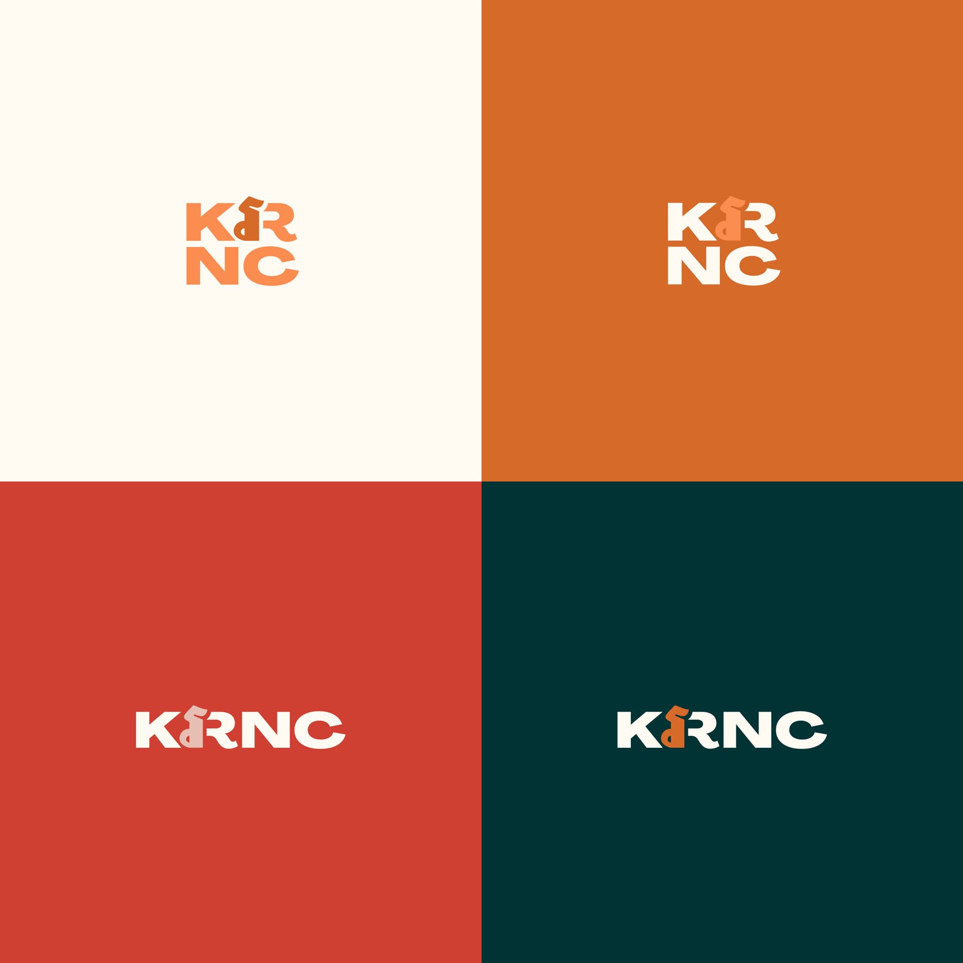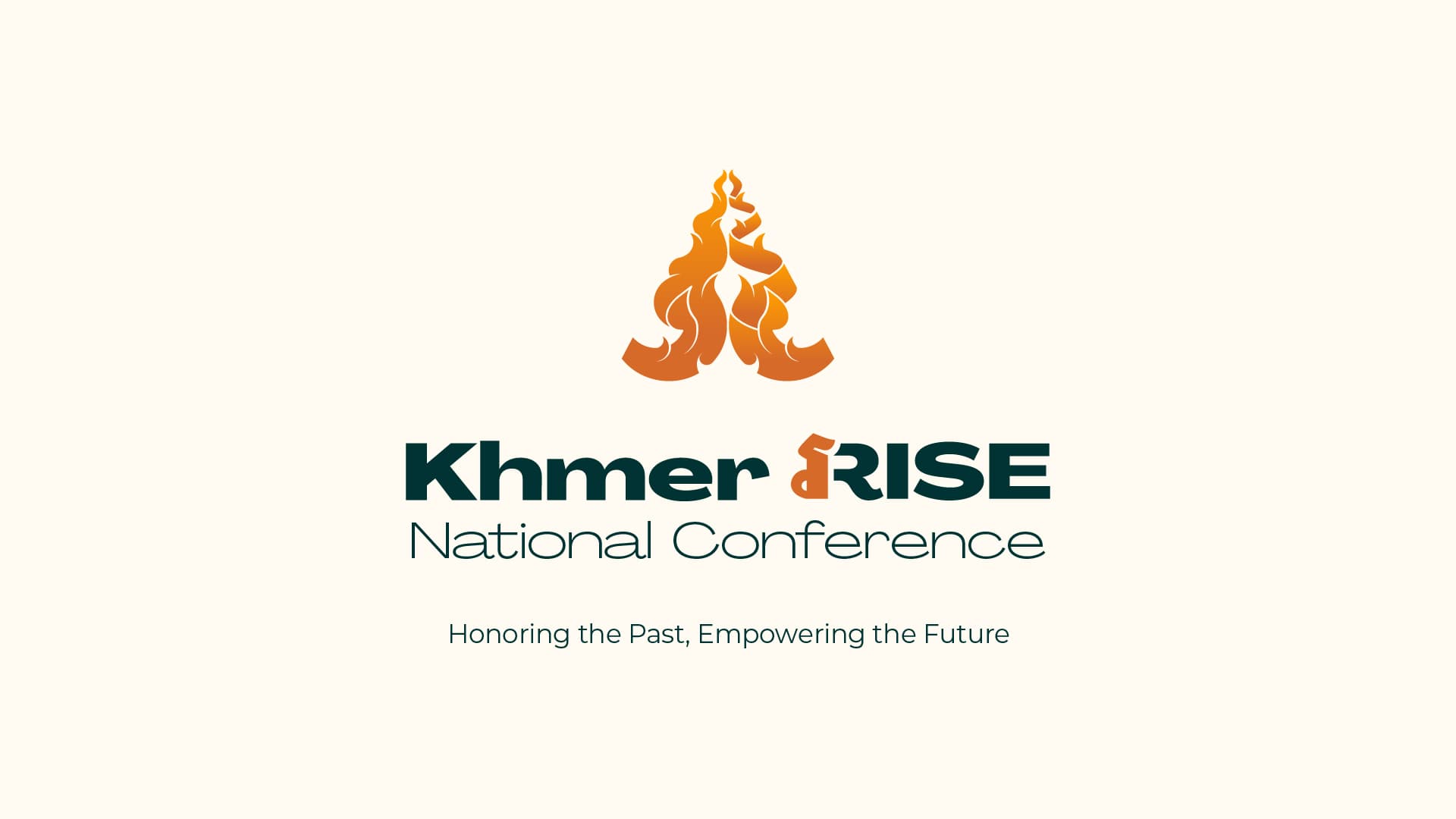
Cambodian Inspired Logo
This logo, representing culture and unity, is inspired by kramas and Khmer kbach in a modern display for a networking conference aiming to foster connections within the Cambodian community uplifting generations old and new.

Inspiration
Khmer (Cambodian) kbach refers to traditional decorative art and ornamental patterns that are used in architecture, sculpture, painting, and various forms of craftwork. The term "kbach" ក្បាច់ means "style" or "pattern" in Khmer, and it is a deeply significant part of Cambodian cultural heritage, often used to adorn temples, royal buildings, and religious objects. Kbach motifs are highly stylized and symbolic, often drawing inspiration from nature and celestial shapes symbolizing harmony, balance, and spirtuality.
The krama is a traditional and versatile scarf that holds profound cultural significance in Cambodia. Typically made from cotton or silk and featuring a checkered pattern in various colors, the krama serves many purposes: it offers protection from dust and sun, is used to carry goods, and can even be given as a gift of honor, much like a Hawaiian lei. More than just a practical garment, it symbolizes Cambodian identity, heritage, and used by people of all ages and walks of life.

Typeface
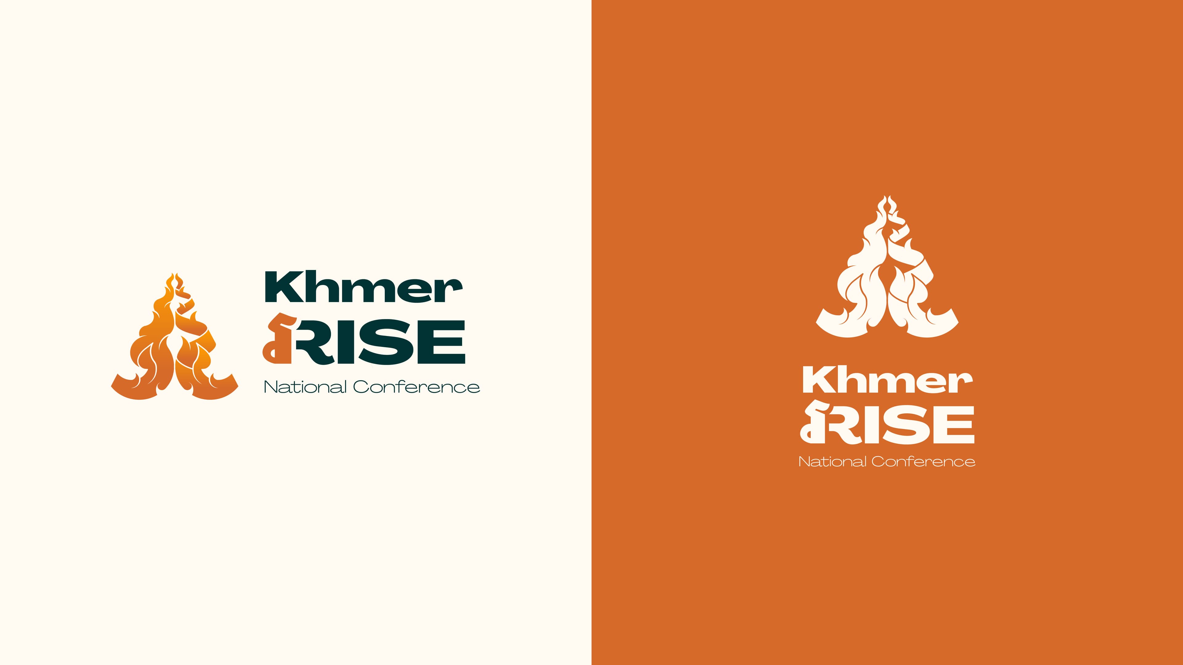
PP Agrandir was selected as the primary typeface for its visual similarity to one of Cambodia's iconic landmark, Angkor Wat. The wide, stretched form of the characters mirrors the temple's horizontal grandeur, while the combination of curves and straight lines reflects the intricate details of its architecture.
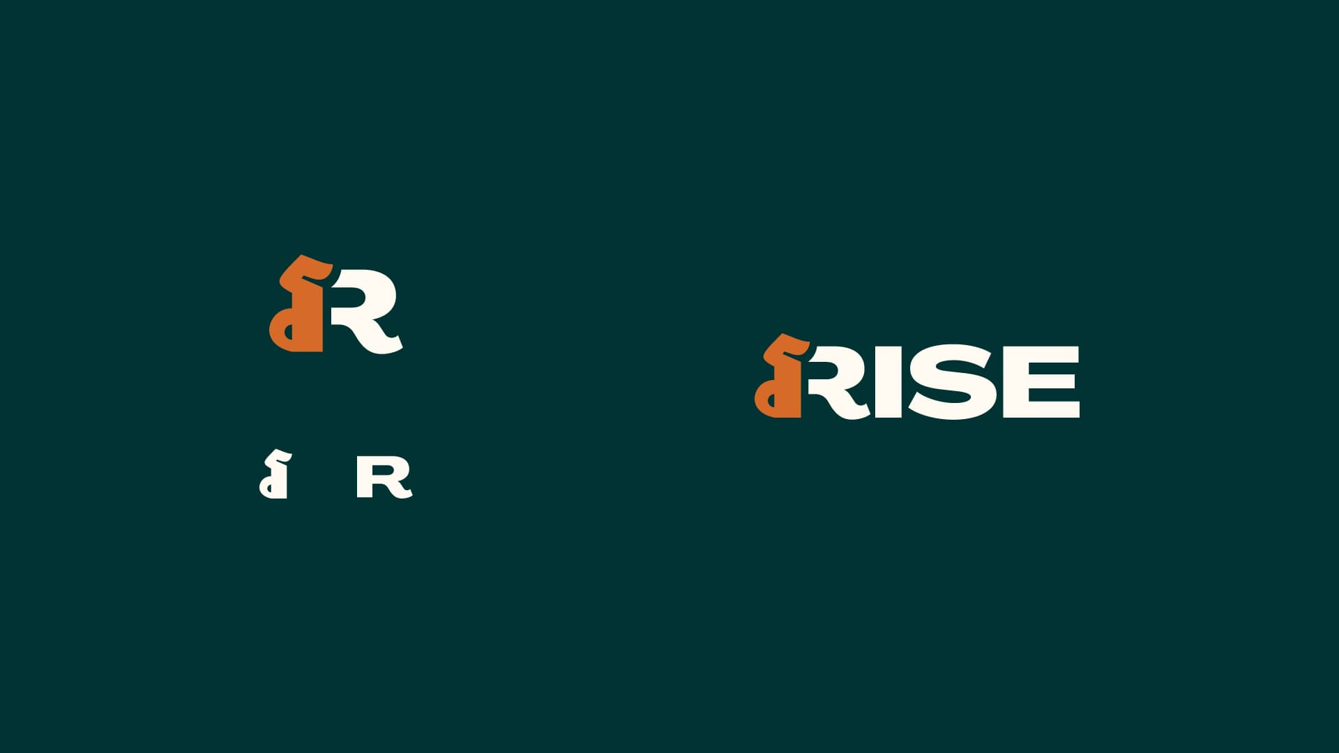
Additionally, the letter "R" was creatively merged with the Khmer character "រ" which begins the Khmer word for "rise" (រហ) further emphasizing cultural relevance. Noto Sans Khmer was chosen for the Khmer script, as its font weight aligns seamlessly with PP Agrandir, creating a cohesive and streamlined typographic design.
Colors
Creating a custom color palette offered limitless possibilities. My goal was to design a palette that both evoked the essence of Cambodian culture and introduced a fresh, modern feel. Orange was chosen as the primary color to symbolize the brand's themes of rise and match the feiry symbolism of the logo. The secondary color, a deep teal, reflects Cambodia's lush jungles and nature, while also adding a sense of richness, symbolizing the country's deep history. This dark teal serves as a backdrop that allows the orange to stand out and glow.
